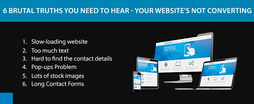
6 Brutal Truths You Need To Hear – Your Website’s Not Converting
Does your website have a low conversion and engagement ratio? Are you troubled that visitors are bouncing off from your website? Perhaps your website is lacking in something or another that is scaring the potential customers away. You may feel everything is fine with your website design and layout, but there may be something hidden in plain sight.

We, at WinnipegTech have stated some of the major reasons why your website is not converting. They may hurt you a bit but it is always better to know the truth.
1. Slow-loading website
Does your website take too long to get loaded? This might be the major reason why your conversion rate is less. People use the Internet on a variety of devices, but mostly on smartphones. Not only is there a problem with connectivity in many parts of the country, but smartphones take longer to load bigger websites.
If your website is cluttered with videos and large images, probably they are the villain. Google also rates your website on the basis of loading speed and slow speed, maybe push you back from the front page.
2. Too much text
Too much text is a major culprit as well. Who would want to go through essays on your website? Nobody. Large patches of text bore people quickly. Websites are for a quick introduction to the business or service ideas. Keep that brief and to the point. Keep the following points in mind :
- Keep your points brief and informative.
- Keep the headings bold and attractive.
- Use short paragraphs or bullet points.
- Use blank space around your text.
3. Hard to find the contact details
One of the most important things for a high conversion is a good follow up. Thus, if your phone number, email address, or other contact details are not clear and prominent, it may cause a problem. It is unwise to keep your contact details at a sub-page, or a contacts page. Most people do not have the patience to keep looking for contact details. This may drive them away.
Always display your contact details where they are visible. It is not smart to place them at the bottom of the page too. Reluctance to display the contact details may also give an impression of you being irresponsible.
4. Pop-ups Problem
If there is one thing about websites that is most irritating, it is the pop-ups. It is still debated if pop-ups really help. They have shown to increase the conversion ratio by about 2% but is that enough? Because if you pop-ups annoy people they may not come to you again.
It is important to know when to use a pop-up and how frequently. If it springs up as soon as the page loads, it’s a thumbs down. If there is a pop-up on every page, that is also a negative. Take care that the pop-up offers some important incentives or services.
5. Lots of stock images
The quality of the images you use on your website also plays a role in enticing your visitors. But if you use lots of generic images, it may have an adverse effect. This does not mean that all stock images are bad, but most of them are. Stock images are generic and cheesy and may not do justice with you.
You may have a beautiful workspace and talented staff, but the stock photos may ruin your presentation. The best way out of this dilemma is to use the original photos of your office clicked by a professional. Or you can hire a graphic designer to create great images for your website.
6. Long Contact Forms
Contact Forms are the last step of converting people into clients. Often sites have a feedback form, that also collects information about the customers. If you drag the form too long, that may cause problems. Nobody would be willing to spend a few minutes filling out a form full of pointless information.
Wrapping up
Always make sure you are not asking for irrelevant or personal details in the form. People may not feel comfortable sharing some information with you. Also, this makes the form too tedious.
